AnaOno
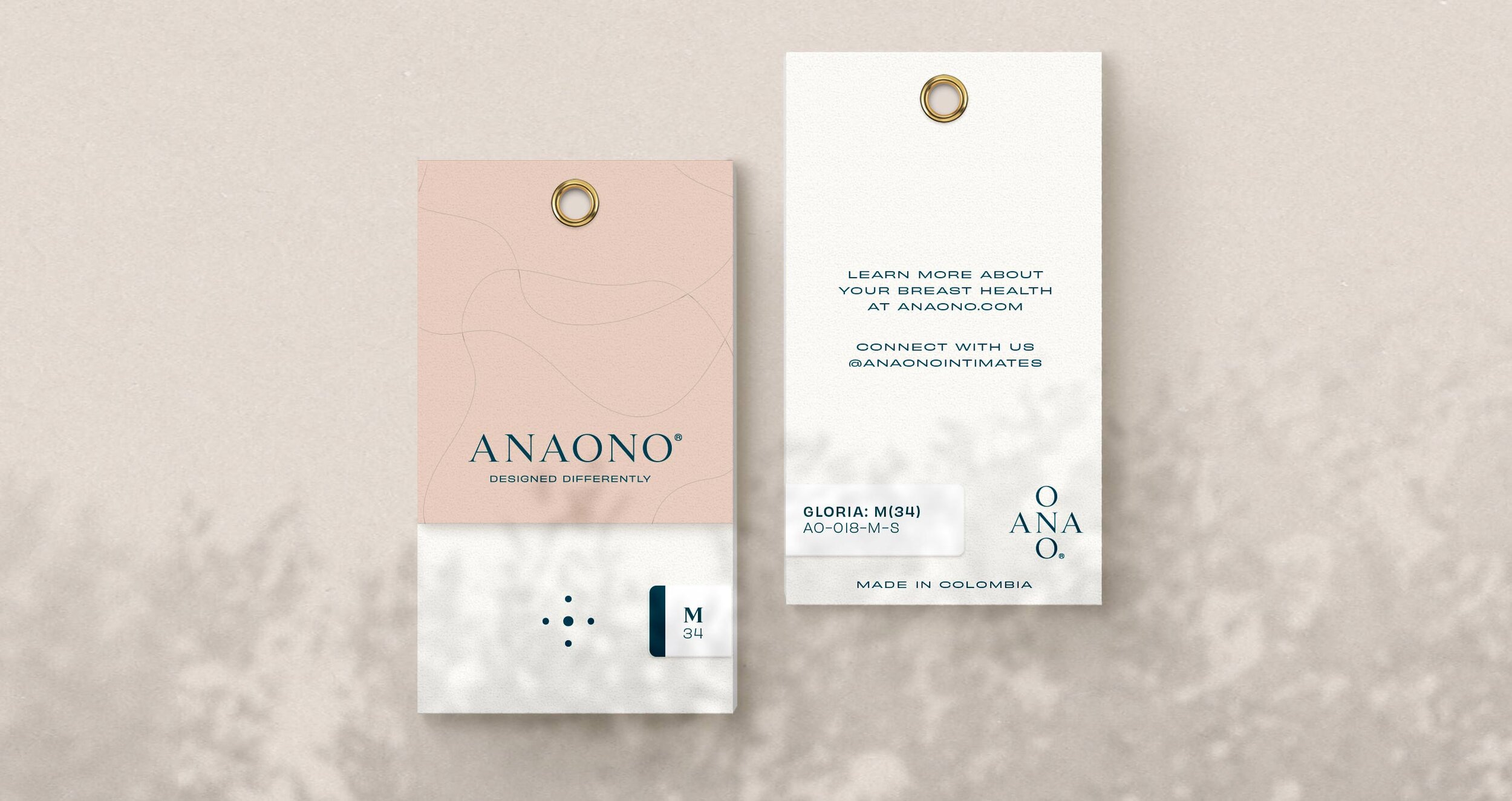
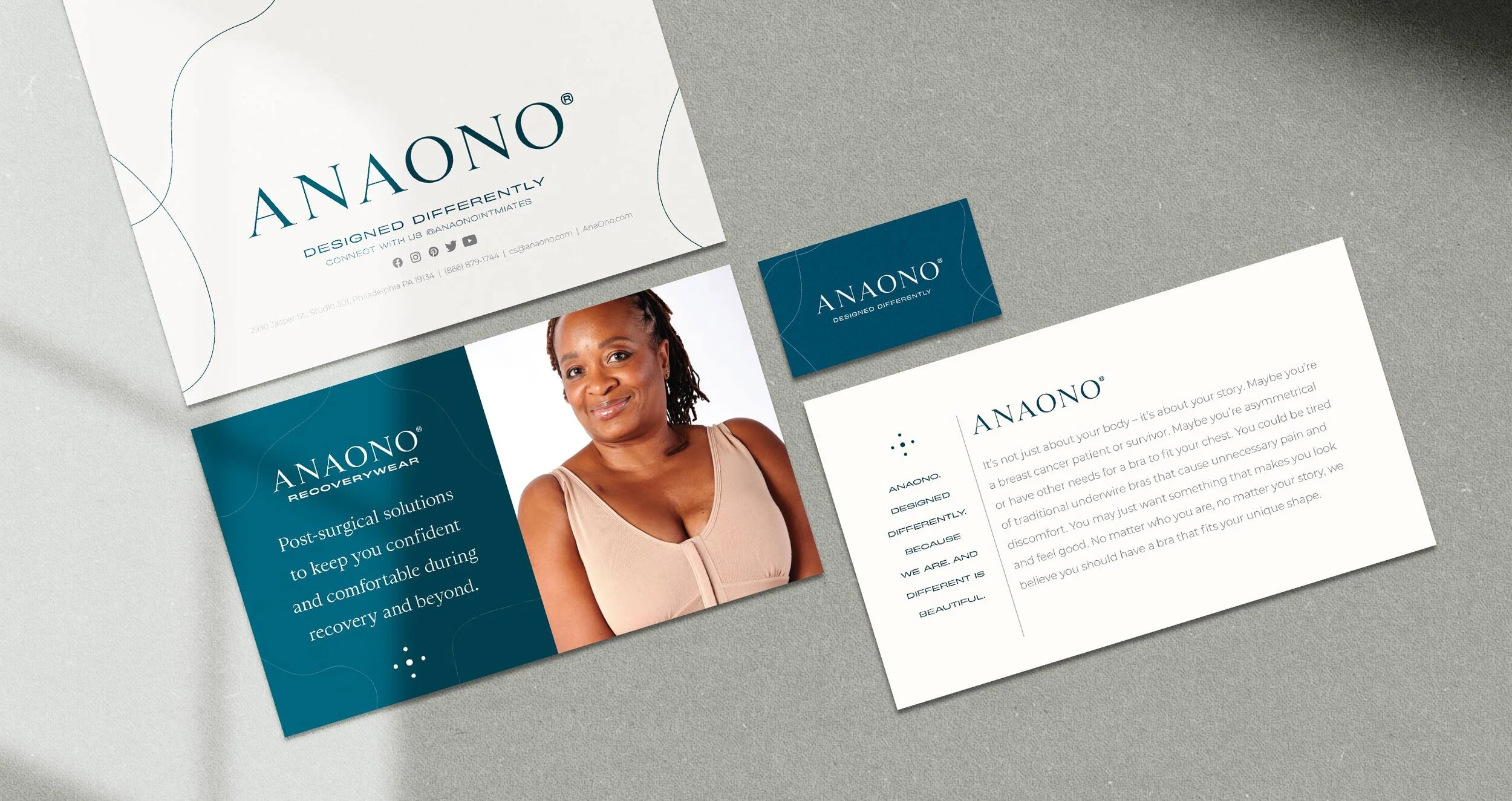
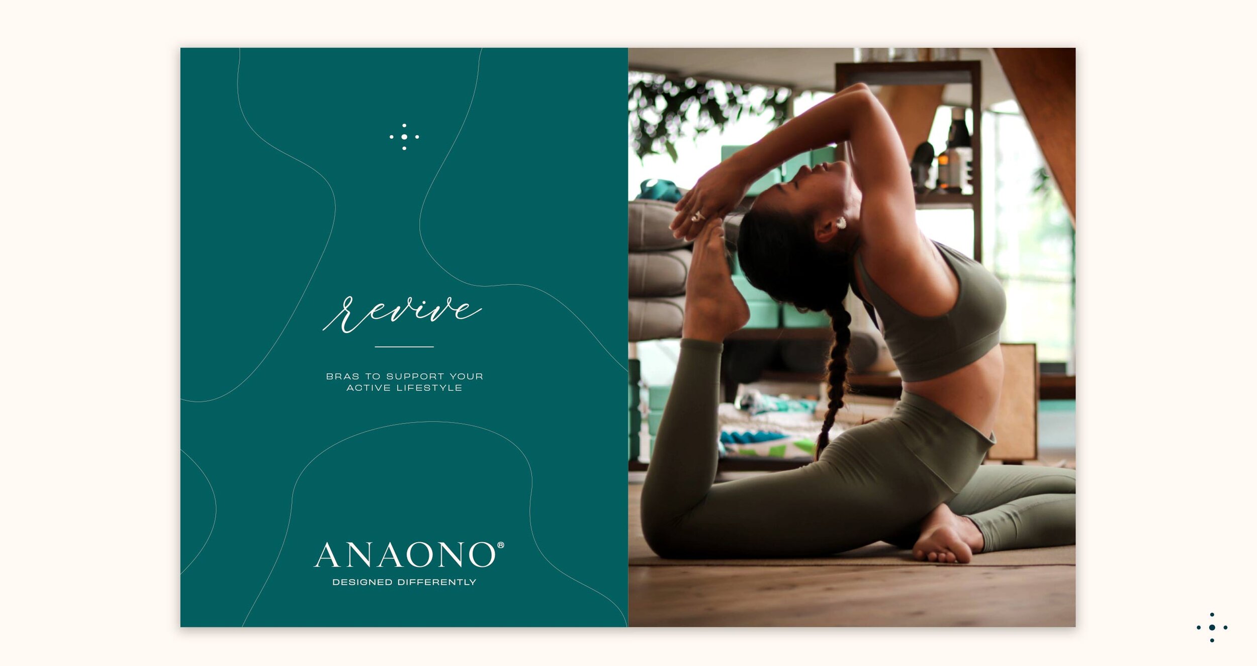
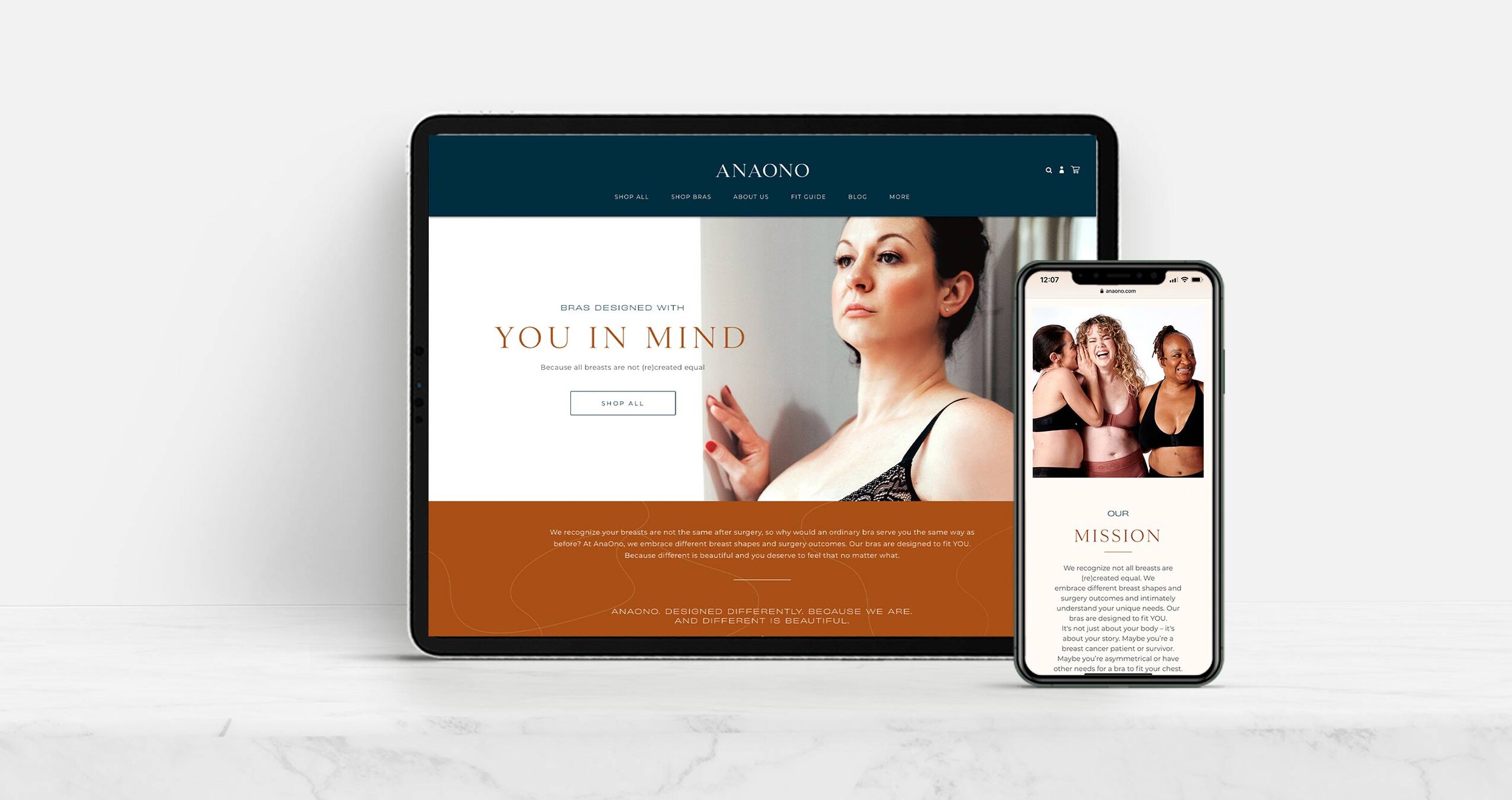
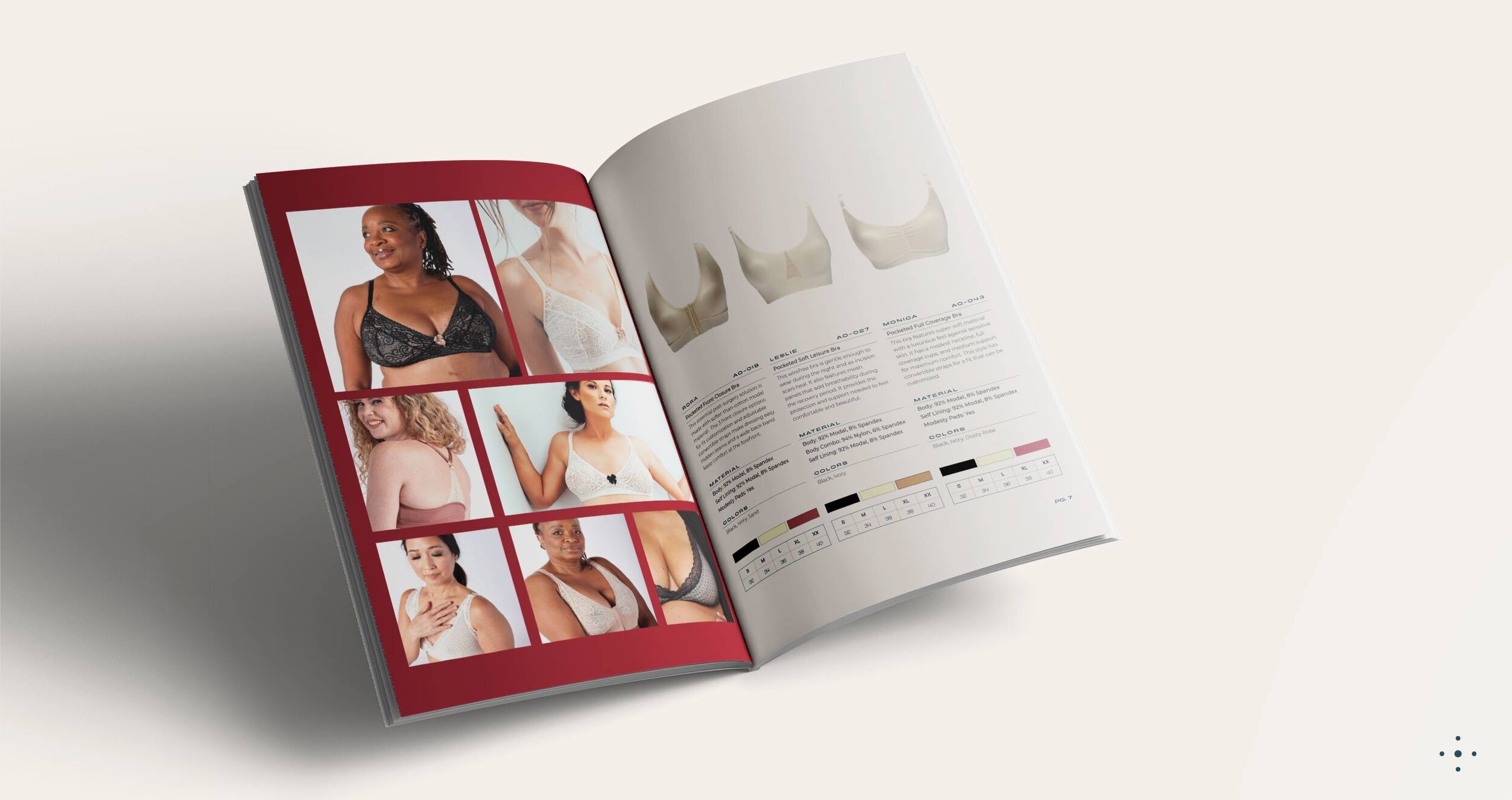
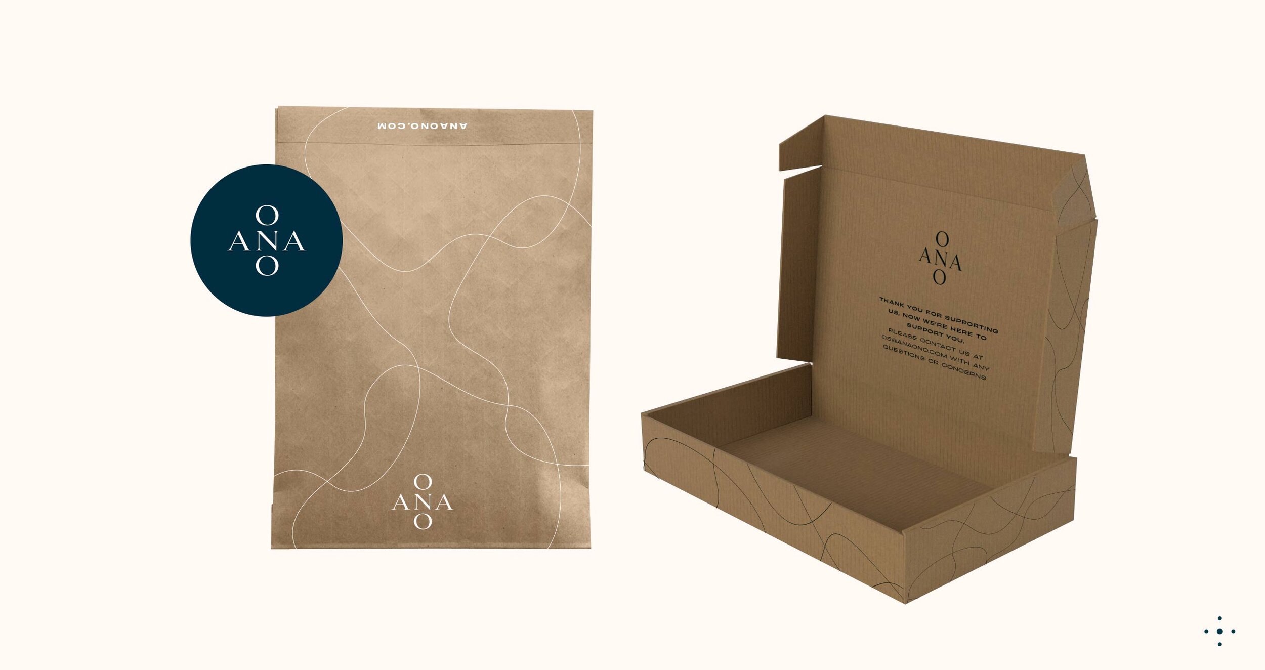

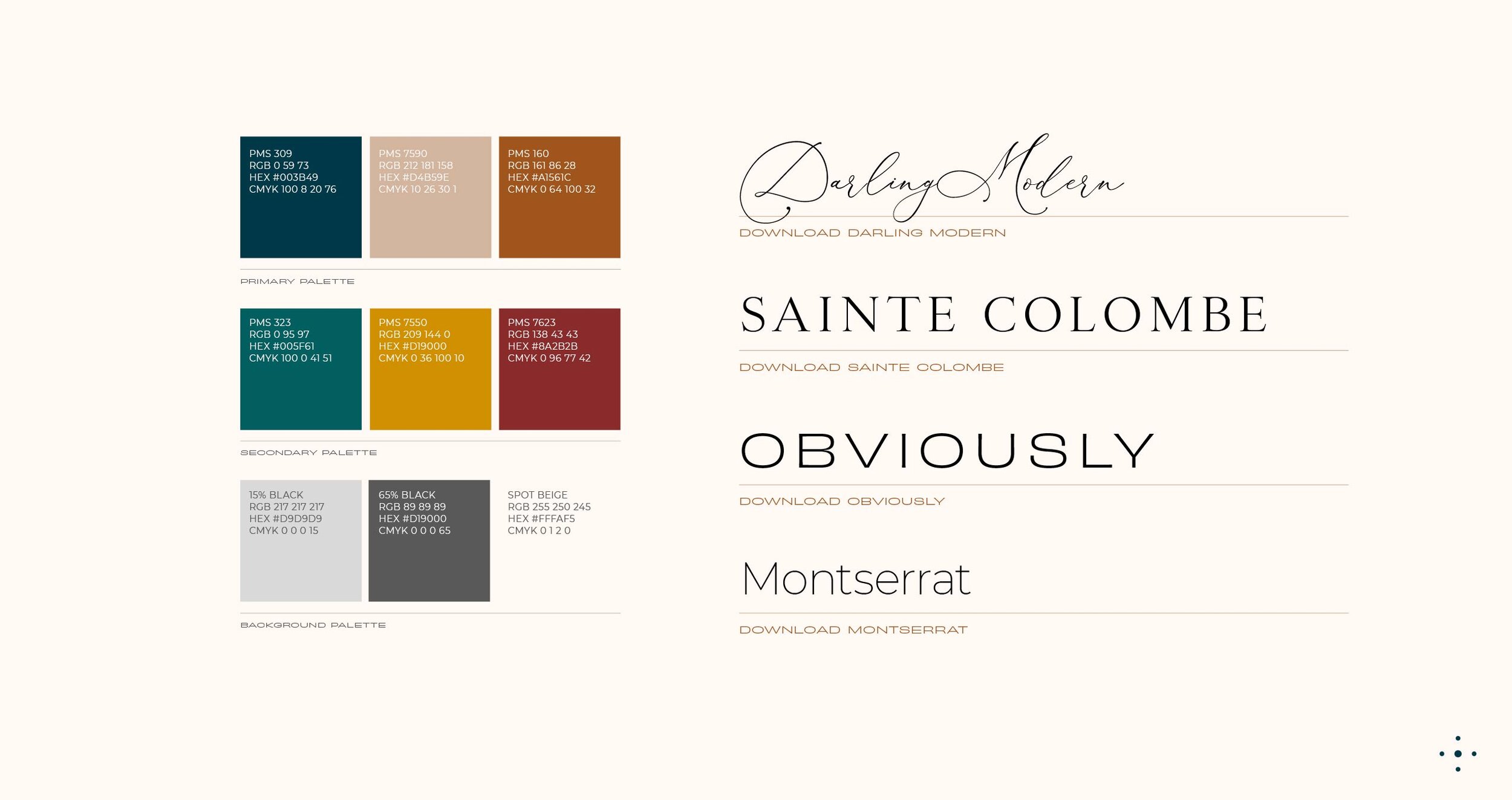
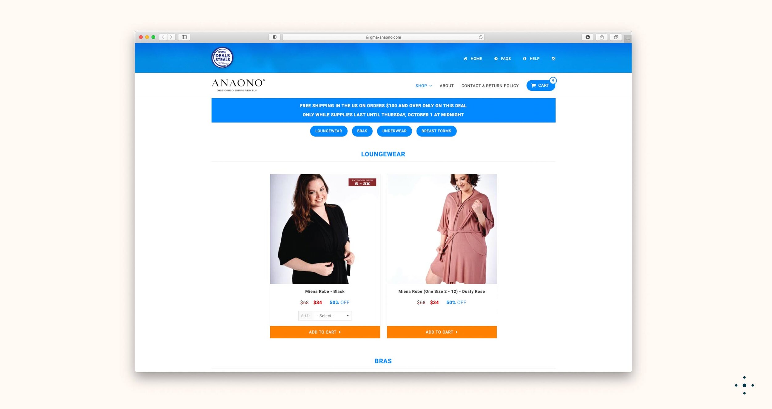
AnaOno began as a line of bras specifically designed for breast cancer survivors, but over the span of a decade, it blossomed into something much larger. Embracing a ‘boob-clusive’ identity, the brand transformed from a gentle, feminine aesthetic into a bold and confident presence. We took a fresh approach to their website, packaging, and all other materials, revitalizing them with vibrant colors, engaging graphics, and a bold new logo. Throughout this transformation, the essence of their mission remained unchanged: to ensure that everyone can find comfortable and inclusive bras that celebrate their journey in recovery.
